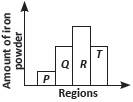
The given bar graph shows the amount of iron powder to the different regions surrounding the magnet(s). Which one of the following figures best describes this graph?
A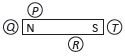
B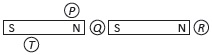
C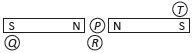
D
The given bar graph shows the amount of iron powder to the different regions surrounding the magnet(s). Which one of the following figures best describes this graph?
A
B
C
D