The given graph shows how the level of pollution changes in an area over a time period.
Which of the following can be most likely concluded from
the given graph?
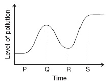
ATrees were cut in large numbers in that area at point P.
BA new factory was set up in the area at point Q.
CThe interval R-S shows that people started recycling
waste and switched to public transport instead of using
their personal transports.
DNone of these
Ans 7:
Class : Class 4
But why not D? If trees were cut down at point P, then why is the point at lowest pollution?
Ans 11:
Class : Class 5
The answer cannot be B because the timeline Q-R is a decrease in pollution whereas if a factory was set up in point Q.Q-R would be an increase of pollution and not a decrease.In point P trees were cut and because of that P-Q is an increase in pollution and not a decrease .So,the answer is not B but A.